
Freight Booking Tool Redesign
Company
DFDSYear
2022The Challenge
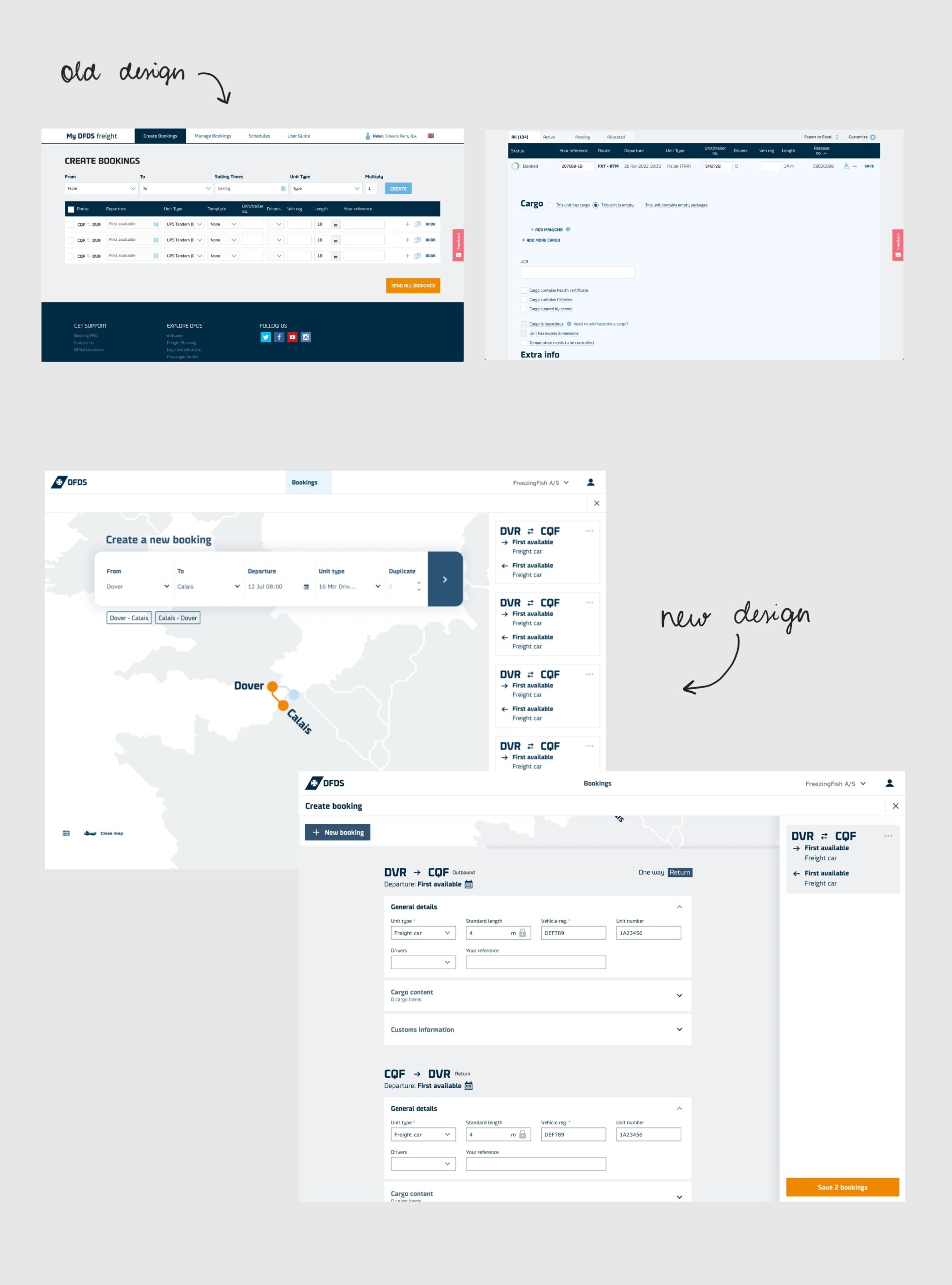
Users were frequently making errors while creating freight shipping bookings due to the complexity and ambiguity of the existing interface. These mistakes impacted operational efficiency and placed added pressure on customer support. The goal was to redesign the booking flow to reduce errors, increase user confidence, and minimise the need for support intervention.
Problem Discovery
The project began with a deep dive into user pain points and stakeholder priorities. It became clear that the current interface made it difficult for users to input the right information. Stakeholders emphasised the need for more accurate data and fewer support requests. During this phase, we also defined the scope of the Minimum Viable Product (MVP).
Co-creation & Ideation
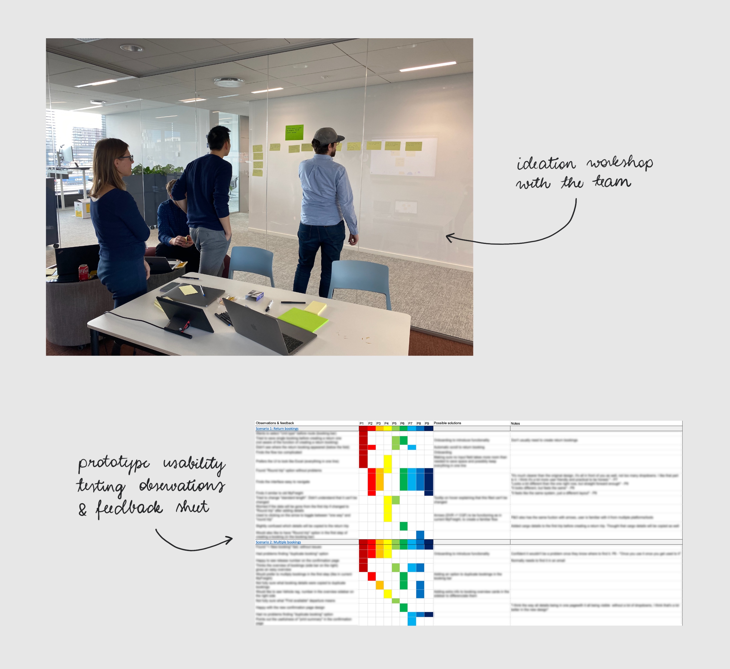
To address the problem, I facilitated brainstorming workshops with a cross-functional team that included developers, the product manager, and customer support. Together, we explored solutions to simplify the booking process and reduce input errors. Early concepts were translated into wireframes for review.
Prototyping & testing
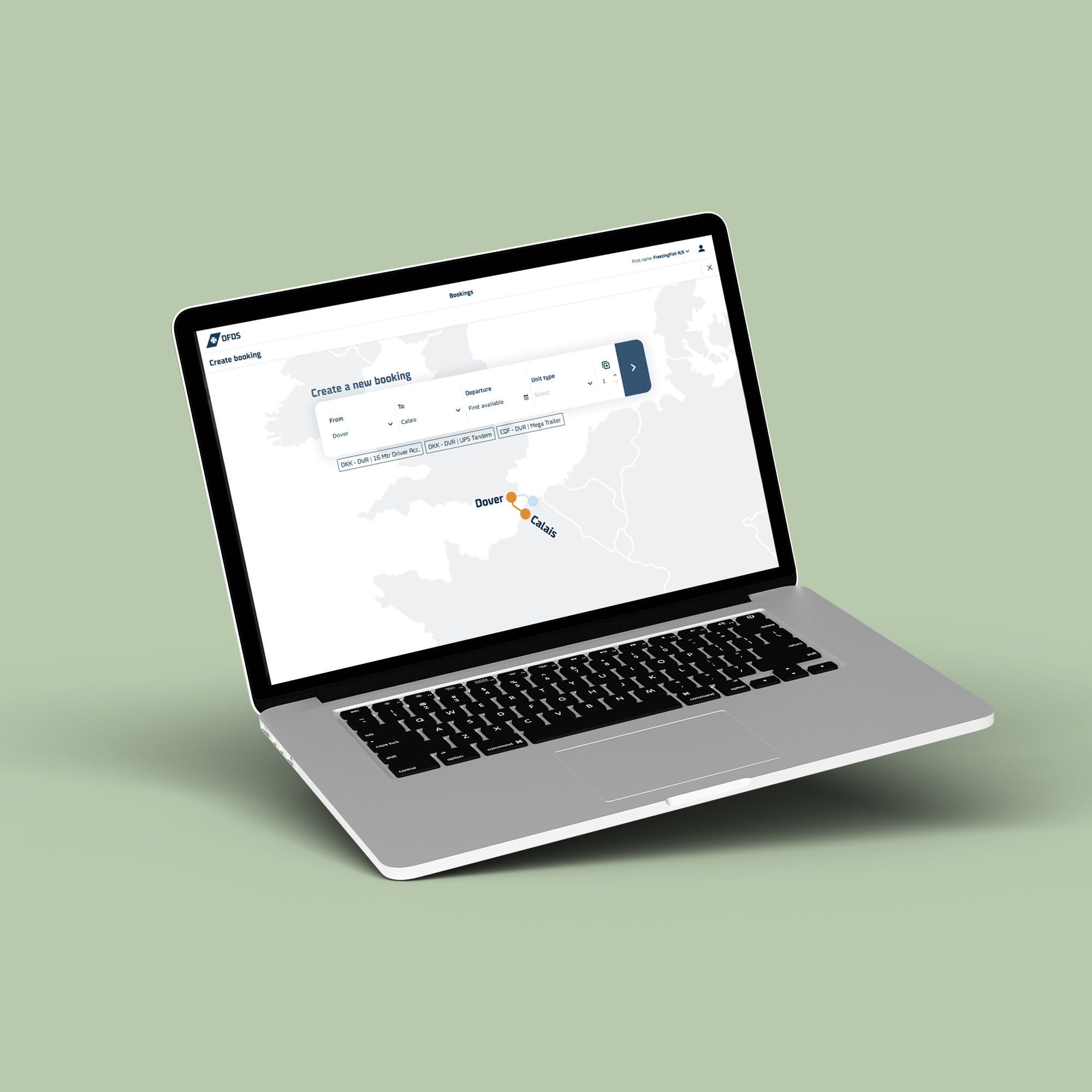
Interactive prototypes were created to explore the proposed design improvements. These focused on reducing user friction and preventing errors through:
- A cleaner, more modern layout
- Real-time error validation to guide users as they entered information
- Clear confirmation prompts to reduce accidental mistakes
We conducted remote usability testing with 9 participants from the target user group. Each participant was asked to complete various booking tasks while their interactions were observed and followed up with questions. The results were clear: booking errors dropped by 95%, and users reported a smoother, more confident experience.
Implementation
Using insights from usability testing, I refined the most critical parts of the booking flow and took the lead on finalising the UI design. I introduced new UI components that aligned with the company’s design system but also gave the product a fresher, more modern feel. These updates not only elevated the visual design but also improved the overall user experience by making booking interactions more intuitive and error-resistant.
Key Outcomes
- 95% reduction in booking errors during testing
- New UI components created to modernise the product and improve UX
- Increased user confidence through clearer interactions and real-time guidance
- Reduced support load, as users needed less help during bookings
- Strong stakeholder alignment, with regular design reviews and shared decision-making